Introduction
Typography
> Fonts
> Text and image
> Technopaegnia
Woodcuts
Cinematic visual logic
- Moving bodies
- Double page spread
- Filmic sequences
Architecture
Gardens and landscapes
Other editions
Mysterious messages
Eros and metaphor
Technical innovations
External links
Typography
The fact that it survives today after half a millenium as a
standard in Western typography makes the Hypnerotomachia
one of the most significant contribution of the
Renaissance to the history of printing.
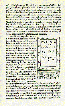
Adding to its typographical tour de force, the book also contains prototypical Greek fonts, one of the earliest examples of Hebrew type, and what are the first Arabic passages in the history of European publishing. (from pp. 16, 18 of L. Lefaivre’s Leon Battista Alberti’s Hypnerotomachia Poliphili). Copyright © 1997. The MIT Press. All rights reserved.
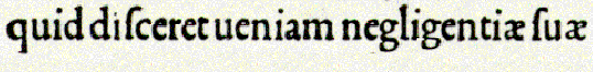
One of the features of the Hypnerotomachia that has attracted the attention of scholars has been its use of the famed Aldine "Roman" type font, invented by Nicholas Jenson but distilled into an abstract ideal by Francesco Biffi da Bologna, a jeweler who became Aldus’s celebrated cutter. This font –generally viewed as originating in the efforts of the humanist lovers of belles-lettres and renowned calligraphers such as Petrarch, Poggio Bracciolini, Niccolo Niccoli, Felice Feliciano, Leon Battista Alberti, and Luca Pacioli, to re-create the script of classical antiquity– appeared for the first time in Bembo’s De Aetna. Recut, it appeared in its second and perfected version in the Hypnerotomachia. (from pp. 16-18 of L. Lefaivre’s Leon Battista Alberti’s Hypnerotomachia Poliphili). Copyright © 1997. The MIT Press. All rights reserved.
Lower case fonts
Technically Biffi’s achievement consists
in having carried out a reduction in the relative weight
of the lower cases, creating what the renowned English
printing historian Stanley Morison has called a
‘superbly harmonious effect.’Appearing after
the domination of the Gothic, when fonts were inspired by
classical calligraphy were still novel, this font is
considered the most modern in appearance of
fifteenth–century types and marks a watershed.
Upper case fonts
This is further enhanced by the introduction
of a delicately proportioned font of capitals.
Bibliophiles and historians of printing, such as Morison
and George painter, admire the rounded and strong outline
of the Hypnerotomachia font, "tall in uprights abd
firmly seriphed, both bold and delicate, equally dark and
radiant in its blacks and whites. Aldus’s
biographer, Martin Lowry, points out that the capitals
have a relative height and weight governed by the 1:10
proportion recommended by Feliciano and only partially
reduced to 1:9 by Pacioli.
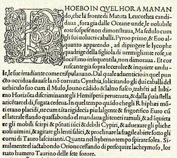
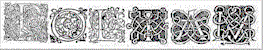
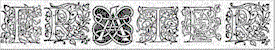
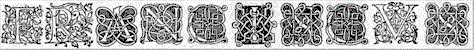
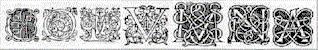
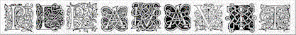
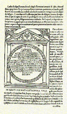
Decorated initials
Equally admired is the particular care lavished on the
decorated initials at the head of each chapter. Some are
in hatchwork, while others, still finer, are decorated in
strapwork or tendriled foliage and flowers.
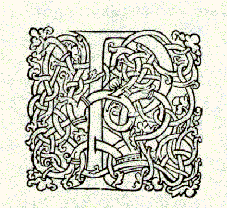
Taken together, they form the acronym
"POLIAM FRATER
FRANCISCUS COLUMNA PERAMAVIT,"
meaning "Brother Francesco Colonna loved Polia
tremendously."
Text
and image
Scholars find that the greatest artistic merit of the
book is neither in typography or woodcuts separately, but
in the overall composition of text and image into a
harmonious whole, which allows the eye to slip back and
forth from textual description and corresponding visual
representation with the greatest of ease – a rarity
even today. (from pp. 16, 18 of L. Lefaivre’s
Leon Battista Alberti’s
Hypnerotomachia Poliphili). Copyright © 1997. The MIT Press. All rights reserved.
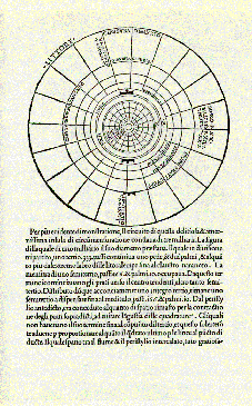
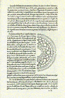
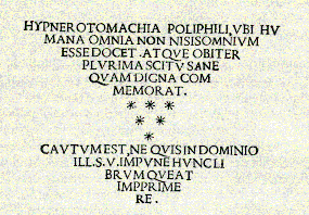
Technopaegnia
Besides displaying a remarkable level of visual culture
and clarity , the Hypnerotomachia must also be seen as an
extraordinary visual-typographical-textual ‘assemblage’
of a type not repeated until the avant-garde books of the
1920s and 1930s. Among its feats of typographical
ingenuity, the form of goblets and drinking vessels is
reproduced in the layout of the text in the page.